


March 23, 2023
During a grueling 162-game stretch, it's smart to have some fun with baseball. Not every game can feel like the state of the world hangs in the balance. The thrills of the World Baseball Classic and October are riveting, but you can't live like that all summer. Revel in the off-the-wall minutiae and the little things that separate a long season like this from the rest of the sports world.
On Wednesday, I ranked the best team names in all of baseball. I will now rank all 30 teams' primary logos for the 2023 season. As I wrote then, "This is not a list of the best, most talented teams overall. It's just a ranking of how cool a given franchise's name is, how it speaks to the region, its history, whether it's iconic and, simply, its appeal."
I'll provide a quick take on the logo after each ranking as well.
Let's get after it...
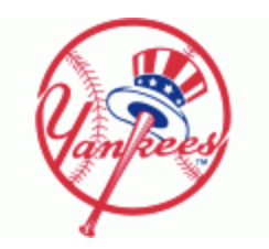
1. Yankees
It's the sport's most iconic logo. Easy choice.
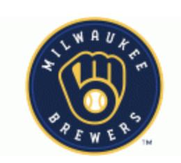
2. Brewers
The 'M' and the 'B' forming a glove? Perfection.
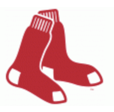
3. Red Sox
Like with team names overall, the Red Sox are just a step below the Bronx Bombers in terms of their importance to MLB history.
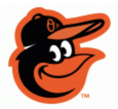
4. Orioles
A cartoon bird wearing a little hat with a different Orioles logo on it? I love it.
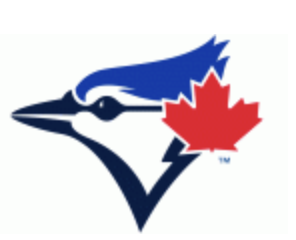
5. Blue Jays
Less cartoonish than the Orioles' logo, but the maple leaf is the touch needed for baseball's lone Canadian team to stand out.
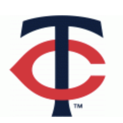
6. Twins
Twins is a name that could not be replicated outside of the Twin Cities. The conjoining 'T' and 'C' work well.
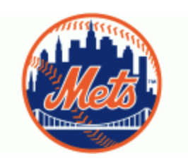
7. Mets
Philadelphians hate New York and the Mets in particular, but this logo sums up the Big Apple with the world's most well-known skyline in it.
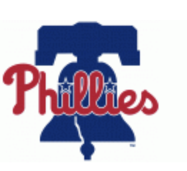
8. Phillies
The Phillies' logo took a step back a couple of years ago, going from the diamond logo and a slightly lighter shade of blue to this. The bell is great and is obviously synonymous with this city's history and the way the bell rings out beyond centerfield after homers, but in comparison to what the Phils have had before, it's a downgrade.
9. Royals
Kansas City doesn't hit you in the face with the royalty themes. The crown on top is just the right amount.
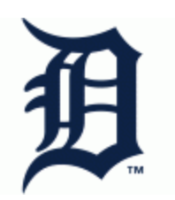
10. Tigers
A classic from a bygone pre-WWII era of baseball.
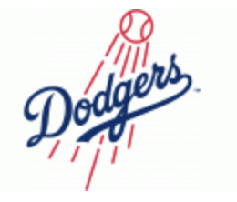
11. Dodgers
This is higher simply because of how popular it is compared to its actual greatness.
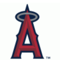
12. Angels
I like subtly. The little halo? Subtle.
13. Mariners
A compass for a nautical-themed team? They understood the assignment.
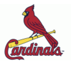
14. Cardinals
Animal logos get it done for me!
15. Guardians
They're trying to do something different here and not be generic after the poor past of its previous name. I respect it. If we get some brand synergy with Guardians of the Galaxy and have a Rocket Raccoon logo, we'd be really cooking.
16. Marlins
It looks like the logo for a bait-and-tackle shop down the Jersey Shore. I mean that as a compliment!
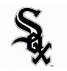
17. White Sox
It's a mainstay in baseball, but "SOX" looks a little too like a different three-letter word that begins with an 'S' and ends with an 'X.'
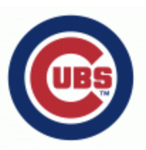
18. Cubs
It's fine.
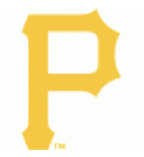
19. Pirates
Their alternate logo with a literal pirate is so, so much better and would have the Pirates top five otherwise.
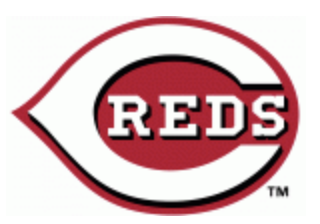
20. Reds
Also fine.
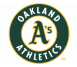
21. Athletics
The elephant logo the A's have used intermittently as an alternate over the years is much better than this. I have a blue Philadelphia A's hat with the elephant logo and it's my favorite hat ever.
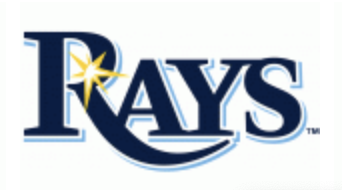
22. Rays
The people want "Devil Rays" stuff and they refuse to give it to us.
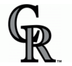
23. Rockies
A great team name gets wasted with something generic. Their mountain range alternate logo from the past is infinitely better.
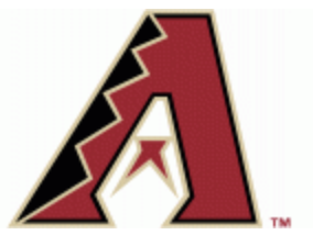
24. Diamondbacks
Bring back the purple and teal colors full time and this logo would be higher.
25. Padres
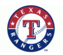
26. Rangers
Boring.
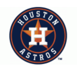
27. Astros
They could be doing so much more with the space motif here.
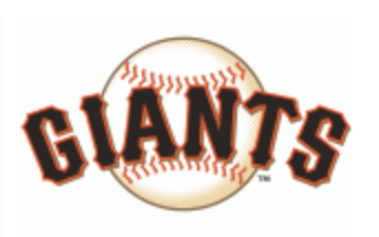
28. Giants
I like the Giants' color scheme and they have a championship-filled history, but this logo just isn't it.
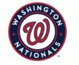
29. Nationals
Painfully boring.
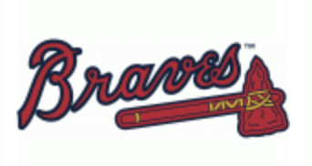
30. Braves
Not a good look to say the least!
On-Deck: Best Uniforms
Follow Shamus & PhillyVoice on Twitter: @shamus_clancy | @thePhillyVoice
Like us on Facebook: PhillyVoice Sports
Add Shamus' RSS feed to your feed reader