


September 14, 2023
 Flyers / Wells Fargo Center/for PhillyVoice
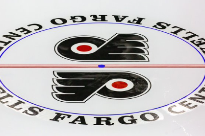
The Flyers' center ice at what will soon be dubbed Xfinity Mobile Arena.
The ice is down at the Wells Fargo Center, complete with the design at center ice that many Flyers fans will tell you the organization never should have deviated from to begin with.
But it's back now, dual logos in the circle, three-stripe red line, and all.
Check it out below:
Finally accepting that the team was in dire need of a rebuild after a third-straight year of missing the playoffs and getting nowhere closer to them, the Flyers have been positioning and branding themselves toward the start of a new era that was marked by the hirings of Danny Brière as the general manager and Keith Jones as the president of hockey operations, along with Dan Hilferty's stepping into the role of the organization's governor and Comcast Spectacor's CEO.
That was all made official back in May, and since then, the Flyers have been clear about wanting to build something new – a faster, more talented team that can stay competitive within today's NHL – but all while being sure to establish a culture that doesn't throw out the team's long history, but rather preserves the best of it.
The new uniforms introduced earlier this summer, which factor in an element from nearly every jersey the Flyers have ever worn, play into that.
So does the switch back to the shade of "Burnt Orange" in the Flyers' color scheme that became synonymous with their near-constant playoff runs in the 80s, 90s, and 2000s.
And now so does the switch back to the classic, and distinct, center ice design that was a fixture of the Spectrum and then the Wells Fargo Center for decades, and a look that had long been a preference of late Flyers owner Ed Snider, per longtime beat Bill Meltzer.
The Flyers started experimenting with their ice design in the last decade or so, mainly trying out different versions of the center-ice red line (like putting mini Flyers logos within it, for example) while sporadically bringing back the classic three stripes in between.
Ahead of the 2019-20 season, they made a radical shift, moving away from the dual logos that split between the red line to instead put one giant Flyers logo within the faceoff circle. And as you'll be able to see over at the center ice design archive TheFaceoff.net, the logo never quite looked right with the line running through it.
Hey, it's going to be a long season (and likely a long couple of years), and this is a small visual step toward getting back to what worked.
The Flyers' rookie camp began today at their training center over in Voorhees, but many of their established players are already there and skating again as well.
The team's full training camp will begin next Thursday, and their first preseason game is set for September 25 against the Devils up in Newark.
The regular season gets underway on October 12 at Columbus.
Follow Nick on Twitter: @itssnick
Like us on Facebook: PhillyVoice Sports