April 13, 2022
The look of the NBA Finals got a massive upgrade, going back to the design the league (arguably) never should've dropped to begin with.
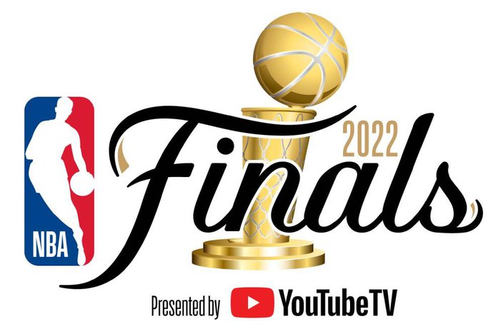
On Wednesday morning, ahead of the second night of play-in games and the start of the playoffs this weekend, the NBA unveiled The Finals' new logo for 2022 (and presumably onward), which brings back the classic script font and a graphic of what sure looks like a re-designed Larry O’Brien Trophy.
Here's the new logo courtesy of the NBA:
The script spelling out "Finals" was first used in the league's postseason branding in the mid-1980s on through to the mid-90s, then made a comeback in 2004 and stuck around until 2017.
The font perfectly matched the prestige of the playoffs' final round and grew into an iconic image in the minds of basketball fans everywhere. If you saw that logo printed on your team's court, they made it.
In 2018, the NBA opted for a brand refresh of its entire postseason, but the look ended up being pretty forgettable.
The NBA has unveiled the logo for the 2022 Finals, bringing back the original script font 🎨 pic.twitter.com/vwUJ70KPjB
— Front Office Sports (@FOS) April 13, 2022
Yeah, it's good to have the script back.
“The NBA Finals serves as the culmination of our 75th Anniversary Season as we celebrate the league’s past, present and future,” Kate Jhaveri, the NBA's chief marketing officer, said in a press release. “Highlighted by the return of our familiar Finals script font, back by popular demand, our new logo pays homage to our league’s history and looks forward to what’s ahead.”
There are a couple of differences to note in this script logo compared to ones from the past. First is the red shooting star that used to cross the F and dot the I. That's been removed. Instead, small strokes of gold were added to each end of the wordmark.
Then there's the new look Larry O'Brien Trophy. If this logo is any indication, it'll have a circular base now instead of a rectangular one and details in the net and lining of the basketball that should stand out a bit more prominently than before.
Here's the full set of the new @NBA Finals 2022 branding, with the Primary Logo, Black & White Logo, Wordmark and Trophy variations. Fun stuff. pic.twitter.com/rIz3CRcSkz
— Conrad Burry 🔴🐐🎨 (@conradburry) April 13, 2022
If that is in fact the new look for the trophy, I do wonder if it'll be any more comfortable to hoist. Between the off-center ball at the top and the rectangular base at the bottom, it always did look like the most awkward title to raise out of the four major North American sports.
Coincidentally, the NBA revealed its new Finals logo about a month after the NHL announced its own complete rebrand of the Stanley Cup Playoffs. You can read all about that HERE.
Also a coincidence: This old NBA on NBC promo that came over editor Evan Macy's Twitter feed as I was writing this post. So there's a quick nostalgia hit for you.
NBA Playoffs on NBC promo (1998) pic.twitter.com/uErDG9FxkX
— 90s NBA (@NBA90s) April 13, 2022
Follow Nick on Twitter: @itssnick
Like us on Facebook: PhillyVoice Sports
