


March 07, 2022
The Stanley Cup Playoffs are getting a facelift.
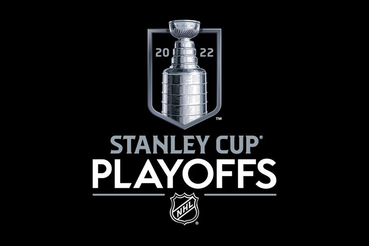
The NHL revealed new logos and branding for its postseason on Monday, replacing the look that’s been painted on to ice and stitched on to jerseys for the past decade.
The new designs feature a more detailed render of the Stanley Cup (you can see the etchings within its rings) sitting within a shield that is supposed to be emblematic of a championship banner. Meanwhile, the new fonts make some pretty unique callbacks to hockey history.
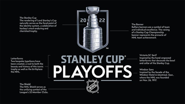
A breakdown of the Stanley Cup Playoff's new logo.
The font that spells out “Stanley Cup” is made to look like the letters engraved on the Cup itself, and the typeface used for “Playoffs” and “Final” is a tribute to the sign on the Windsor Hotel in Ontario, where the NHL was founded way back in 1917.
The new designs were produced by Fanbrandz, a sports branding agency that has a long history of work with both the NHL and Major League Baseball, and were also made to be customizable to the logo and colors of every NHL team.
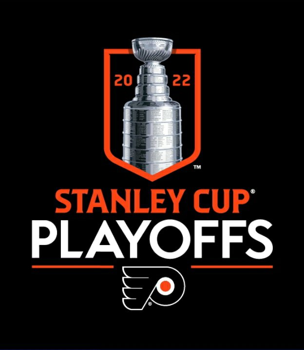
In fact, you can see what every team’s playoff logo looks like on a microsite the league published, regardless of their place in the standings. Yes, even a Flyers one.
In an alternate universe, maybe.
We probably won’t be seeing that Flyers one be used for a long time, though. Not with the way they’ve been playing.
Follow Nick on Twitter: @itssnick
Like us on Facebook: PhillyVoice Sports