May 17, 2023
The latest internet conversation among Eagles fans doesn't have anything to do with the team's players, coaches or draft selections. Rather, fans are sharing their thoughts on a TikTok user's idea for a redesigned Eagles logo.
Emily Ollendick, the graphic designer behind the TikTok account Emily Morgan Creates, posted a TikTok last week that detailed her ideas for a new Eagles logo — and fans had many thoughts. Ollendick has become known for her videos of redesigned sports logos, gaining millions of views.
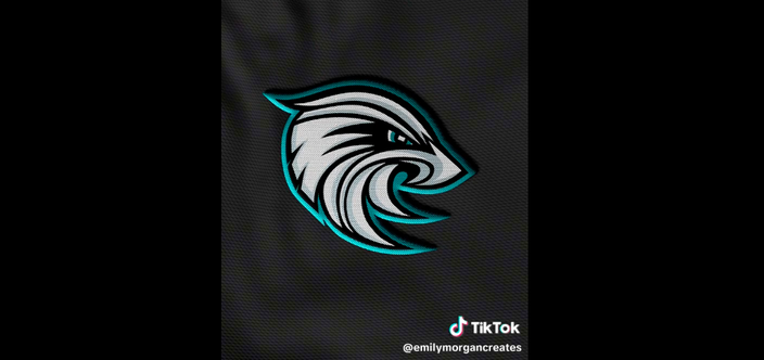
The video came after the Eagles' TikTok account commented on one of Ollendick's previous posts, asking to see the Emily Morgan Creates version of the Birds' logo. The artist then tweaked the fierce eagle that the Philly fans have known and loved for more than 20 years into the following:
Graphic designer Emily Morgan posted a TikTok detailing how she would redesign the Philadelphia Eagles' logo.
Among the most noticeable changes is the compressing of the bird's head, although it could be argued that is more anatomically correct. The bird is also facing the opposite direction. The actual Eagles logo is the only NFL logo that faces toward the left, allowing for a hidden letter "E" in the feathers.
Ollendick's artwork often gives attention to subtle details — in her recent video of the Chicago Cubs' logo, she used the shape of Chicago's "Bean" sculpture as the bear's nose. On the Eagles redesign, she squeezed the shape of Pennsylvania into the bird's pupil. The Eagles' TikTok account commented "The eye tho" acknowledging the hidden feature, but others said they wished the state's outline was more identifiable in the tiny eye.
The video of Ollendick's redesigned Eagles logo has received hundreds of thousands of views on her TikTok and Instagram accounts. A Twitter repost by the Eagles Nation fan account also has been seen more than 1 million times. Though much of Ollendick's work receives high praise from the teams' fans, Philly fans seemed a bit more discerning.
"Absolutely not," reads one of the top comments on the TikTok video.
Along with lamenting the change in direction of the bird's head, TikTok commenters said the actual logo is already "perfect," calling Ollendick's version a "miss" and "not creative enough." Over on Twitter, users harshly called it "cartoonish," "horrible," "trash" and even said it looks like a "Pokemon" or "some kind of alien squid bird."
Some fans said the artwork reminded them of a high school, college or minor league logo. One TikTok commenter pointed out the logo's similarities to Marquette University's golden eagle, which Ollendick acknowledged may be a subconscious mistake since she is an alumna of the Wisconsin college.
The comments were not entirely negative. Some fans said that they like Ollendick's artwork but simply prefer the current design.
"I respect Emily and a lot of her logo designs have been fantastic, but I feel like the current Eagles logo is modernized enough and is one of the better logos in the league currently," reads one of the more tame responses on Twitter. "Her revamp is pretty good, but I’d keep the current one."
The Eagles' logo has changed many times through the years, with differing versions of the bird of prey. The most recent update came in 1996, the first year the team wore midnight green uniforms.
A logo redesign doesn't seem to be looming in the near future for the Birds — and Ollendick's TikTok bio notes that her designs are "just for fun" — but harmless debates like this one certainly keep Eagles fans entertained while waiting for another highly-anticipated NFL season.
Watch Ollendick's full TikTok below:
@emilymorgancreates Replying to @Philadelphia Eagles Philadelphia Eagles logo ✨redesign✨ #nfl #nfllogos #logodesign #philadelphiaeagles #philly #eagles #jalenhurts #graphicdesign #football #ajbrown #iggles #madewithenvato #qb @Philadelphia Eagles ♬ Watch This (ARIZONATEARS Pluggnb Remix) - Lil Uzi Vert & sped up nightcore & ARIZONATEARS
Follow Franki & PhillyVoice on Twitter: @wordsbyfranki
| @thePhillyVoice
Like us on Facebook: PhillyVoice
Have a news tip? Let us know.
 emilymorgancreates/TikTok