


January 16, 2019
Slack, the computer application we all now use to silently talk to our coworkers instead of emailing each other, decided it needed a new logo on Wednesday.
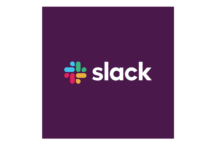
The old logo was great, the company said in a blog post, but it only worked at certain angles, and it was so complicated (in involved 11 different colors!) that it was a headache for all involved.
So Slack changed its logo to this:
Ta-da! From today, Slack has a new logo, the start of a general refresh of our look. A little simpler, a little clearer, and (we think) a little better. Read more about this change in the handy blog post we’ve written about it: https://t.co/LT1ju7kGxw pic.twitter.com/aceZMCb5St
— Slack (@SlackHQ) January 16, 2019
It’s not offensive, and if we weren’t all used to the (now) old checkered Slack look it wouldn’t have ruffled any feathers. The way Slack is using the bits of the logo on its Twitter header, kind of like ice cream jimmies, is also fun:
Of course, everyone on the internet decided to weigh in on this Very Internet topic. We’ve rounded up some of the best and brightest takes on Slack’s logo, for your convenience:
I am okay with this new sweaty slack logo
— Old Guard Rupert (@davatron5000) January 16, 2019
— Trizephyr (@trizephyr) January 16, 2019
Are you a sprinkler company now?
— Jr. Tech Recruiter (@codersplzaccept) January 16, 2019
I thought Slack's new logo looked familiar pic.twitter.com/D6zg56iQBS
— Jeremy Stretch (@jstretch85) January 16, 2019
Really digging the new Slack logo. pic.twitter.com/tKPRNe1ajl
— Colin Flanigan (@llergies) January 16, 2019
#Slack has a new logo that I'm pretty sure is actually four ducks sewn together in an uroboros human/duck centipede. You add eyes and you can't miss it. pic.twitter.com/IMDNwagkFG
— HisReptilianMajesty (@HisRepMajesty) January 16, 2019
new slack logo has one of those fun "once you see it you can't unsee it" things pic.twitter.com/u0MMMHZ2yV
— metal.txt (@metaltxt) January 16, 2019
Capsule pills and sweat? Talking pills? Unicorn poo?
— Susie Felber (@susiefelber) January 16, 2019
I'm not sure I get it Slack, but if you're happy honey, I'm happy.
I just want you to be happy.
In the end, it’s not bad and it actually might be good.
But it’s new, so everyone’s going to yell about it for a while.
Follow Adam & PhillyVoice on Twitter: @adamwhermann | @thePhillyVoice
Like us on Facebook: PhillyVoice
Add Adam's RSS feed to your feed reader
Have a news tip? Let us know.