


June 08, 2017
 Sinead Cummings/PhillyVoice
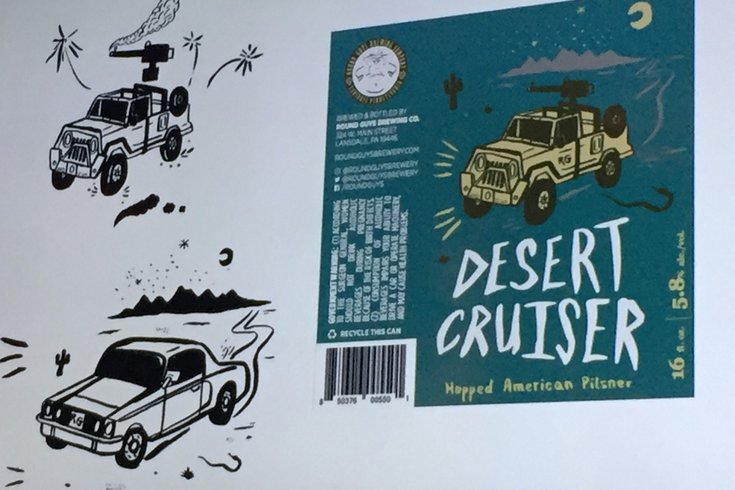
A slide from the panel discussion "Art on Beer" showing a sketch and the finished label design for Round Guys Brewing Co.'s Desert Cruiser.
Be honest. You've bought a beer just because the label looked cool.
Philly Beer Week hosted "Art on Beer" at Frankford Hall recently, where a panel of five artists and designers spoke about their experiences creating beer labels for popular brands.
Each had there own stories to tell about creating original and inventive beer label art.
Lindsey Tweed, introduced as "the force of nature behind the Tröegs redesign," explained how the brand found its new look in 2015.
The founders weren't thinking of redesign when they asked Tweed to create a label for Hop Knife, which, at the time, was a new fall seasonal. Once they saw the packaging on shelves and noticed how fresh it looked compared to everything else, however, they decided to take a look at their logo, labels and overall design.
"Craft beer has absolutely exploded. The shelves are really crowded. You really need to look at what's out there in the market and what's going to stand out," Tweed said.
The redesign started with the logo, which changed from a circle with a lot of words to an abstract hop cone shape with "Tröegs Independent Brewing."
"It's simple, but it's more recognizable than a circle," Tweed explained about the look.
From there, Tweed worked on making the design unified and true to the brand's history. Each beer would feature a unique piece of key art, which would show either the beer's flavor or the story behind the beer, and hand lettering. For the more iconic Tröegs brews, the design wouldn't change too much.
"In the case of Mad Elf, [the character] became a little more jolly and a little less creepy uncle," she said.
Daniel Endicott and Forest & Main co-owner Gerard Olson opened a brewery in a Victorian-style house over five years ago. About three months into being open, they started to bottle their saisons.
"Never really discussed what was going to be on our labels, but in the process of opening, the house kind of started telling us stories," Endicott said.
"For the first label, we decided to do an image of the house from afar. Then, somehow, all of our labels would relate to the house, to the brewery, to us."
The labels on the brewery's monthly bottle releases tell stories, that seemingly connect to one another. Through them, Forest & Main have created their own mythology.
"We're kind of finding the story out with each label."
One label has a gardening troll in the house's basement, another has a bird-man creature on stage. Endicott, who draws each label, finds inspiration from Egyptian art, South American art and sometimes random YouTube videos he's watched with Olson when closing the brewery.
He has total free rein when it comes to design, since the bottles aren't going onto store shelves. Instead, those who want the new releases line up down the block outside the brewery.
On new IPA can labels, Endicott abandoned the line work prominently featured on the saison bottles and instead chose to do abstract watercolor paintings.
"They're just colors and shapes. It's completely fun for me," Endicott said.
While he enjoys designing the saison bottles, the new venture has let him be even more creative.
Mikkeller, a microbrewery founded in 2006 in Copenhagen, Denmark, hired Keith Shore as a freelancer in 2010. The designer worked out of his backyard in Bucks County, creating labels for new beers.
"I found out Mikkeller makes a s**t load of beers and I continued to beg them for new projects," Shore said.
"I kind of started working on a character because I figured if people started to like [the character] then [Mikkeller] couldn't get rid of me."
The strategy worked for Shore, who is now art director for the brand. A new label Shore is excited about has been created for Scandinavian Airlines, which Mikkeller brews exclusive beer for. It should debut in the next month or two.
The beer label has been created with black light ink and glow in the dark ink. According to Shore, the airline's planes are putting black lights in just for the beers.
Owner of Neshaminy Creek, Jeremy Myers, had an idea to put vacationing gnomes on a beer label.
"Somewhere a kernel of an idea comes about, and it's given to me and I run with it," JP Flexner said.
The artist's deadlines are typically pretty short, with assignments for beer labels coming in batches, so he often takes inspiration from those at the brewery. As a way to ease the workload, Flexner created a font template from his own handwriting, but each label still gets hand drawn in a process similar to comic book creation.
"I'm constantly coming up with new stuff, so I try not to get too tied up in one idea or one label. It's best not to overthink this stuff sometimes. I mean, sometimes I just like drawing wizards and dragons," Flexner said.
"I would never go so far as to call myself a designer. I don't really know how to use a computer," Keith Greiman said.
Greiman is an artist, with murals at Honeygrow on Front Street, at Elixr Coffee in Center City and at Søle Artisan Ales in Easton, PA. He also collaborated on beer label designs for Round Guys and Highway Manor.
For Round Guys, Greiman teamed up with Alex Peltz (also featured on the panel). Greiman would send Peltz sketches, who would then color the illustration, or add to the illustration, through a computer program.
"It's nice for me to work with someone who has more of a design background to give [the label design] more of a cohesive context," Greiman said.
When working for Highway Manor, Nick Apice was Greiman's collaborative partner. For the brand's strawberry ale, they decided to create a "stud Mr. Strawberry," as an attempt to appeal to women who would like a fruity drink.
For Greiman, a project's inspiration can come from anywhere, like a person's favorite song or their hobbies.
Alex Peltz, designer for Hill Farmstead, believes he got into designing beer labels because he started drinking beer when he was really young.
"Probably the tail end of when I was collecting baseball cards," Peltz said.
Peltz and owner Shaun E. Hill grew up together. When Hill opened a brewery, Peltz knew he wanted to get involved. He wasn't trained as a graphic designer (he was an anthropologist), but figured he would learn through working.
Hill Farmstead's brand identity was developed by a designer in Copenhagen, Denmark, but Peltz expanded on the label system. Many of the beers are dedicated to Hill's ancestors or to philosophy – giving each beer its own personality – and come out frequently.
The logo needed to be easily replicated, so a simple label system worked best. Each beer would have the same logo and a different color to distinguish it.
Peltz has also collaborated on beer labels for other brands. He was asked by Tired Hands owner and artist Jean Broillet to help make sketches fit together for a design.
"I will take very little credit for the Tired Hands stuff. I'll get a sketch, maybe on the back of a napkin or texted to me at 2 a.m., and I have to do something with it," Peltz said.
He'll take the sketches and decide how the elements fit together, what story they tell, and then color it through a computer program.
For Peltz, it's fun. He enjoys the creative freedom.
"You could put anything on a label and sell it. People are going to consume beer no matter what," he joked.