March 12, 2020
 Drew Harris/@drewaharris
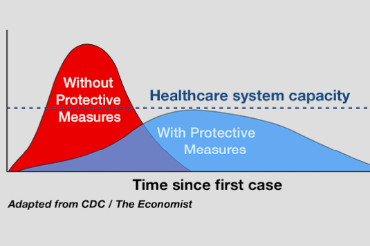
This graphic shows how protective measures mitigate the infection rate during a pandemic, preventing the health care system from becoming overwhelmed. It went viral when Drew Harris, a Thomas Jefferson University professor, tweeted it using #Flattenthecurve.
A graphic showing two possible outcomes for the coronavirus pandemic went viral after a Thomas Jefferson University analyst amended it to highlight the capacity of the U.S. health care system.
Professor Drew Harris shared his contribution to graphic on Twitter on Feb. 28, using #FlattentheCurve. His post took off.
The original graphic displayed how preventive measures reduce the infection rate, though the total number of cases ends up being the same. Without attempts to spread out the number of people who get COVID-19 over time, the volume of patients will spike quickly but eventually see a sharp decline.
But that first chart failed to highlight one very important factor that puts the importance of flattening the curve in perspective: access to health care.
Harris, a population health analyst at Jefferson, added a dotted line across the original graphic, created by The Economist using CDC data, to note the level at which the U.S. health system becomes overwhelmed.
A sharp increase in infection rate overwhelms the health care system. But by flattening the curve – which requires implementing measures to reduce the infection rate – more sick individuals receive the care they need. That lessens the total cases of COVID-19 that could result in death.
He has since received considerable attention for illustrating how all of these statistics related to one another, speaking this week with both the New York Times and NPR about the graphic.
At Jefferson, Harris teaches lessons on pandemic preparedness. Prior to the coronavirus pandemic, Harris instructed students that the rate of infection must stay below hospital capacity in order to save the most lives.
As the rate of U.S. coronavirus infections increased, Harris took to Twitter to share his lesson with others. Even though preventive measures may not stop the total number of cases, they will slow them. The dotted line he added to the graphic, marking the "health care system capacity," exemplified his point.
Important to remember that #Covid-19 epidemic control measures may only delay cases, not prevent. However, this helps limit surge and gives hospitals time to prepare and manage. It's the difference between finding an ICU bed & ventilator or being treated in the parking lot tent. pic.twitter.com/VOyfBcLMus
— Drew Harris (@drewaharris) February 28, 2020
The less people who contract coronavirus at once, the less likely it is that hospitals will be unable to cope with a large influx of sick patients or suffer staff shortages due to medical providers falling ill.
"It's the difference between finding an ICU bed and ventilator or being treated in a parking lot tent," Harris said about flattening the curve in his post.
While social distancing helps people maintain somewhat normal daily lives, it also ensures more patients get hospital care. Through preventive measures, like the cancellation of large public events and keeping a distance from sick or vulnerable relatives, lives may be saved.
It is uncertain when coronavirus cases will peak in the United State or how many will be infected, but Harris' amended graphic offers a reminder that the capacity of health care system is a critical component.
Follow Allie & PhillyVoice on Twitter: @allie___miller | @thePhillyVoice
Like us on Facebook: PhillyVoice
Add Allie's RSS feed to your feed reader
Have a news tip? Let us know.