


September 11, 2017
 Will Geary/Vimeo
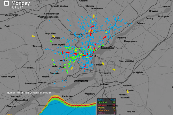
TransitLand generates frequency maps of buses, subways, trolleys, trains and more in Philadelphia.
Every single day, thousands of commuters throughout the Delaware Valley navigate Philadelphia on SEPTA's subways, buses, trolleys and regional rail lines. Annual ridership soared above 308 million rides last year, a dizzying figure that doesn't quite do justice to what this actually looks like from a public transit perspective.
On any given weekday, for example, the Broad Street and Market Frankford lines respectively make 624 and 380 trips, according to SEPTA's 2017 route statistics report. More than a hundred regular and specialty bus routes in Philly average anywhere from 50 to 250 or more daily trips. And each of the 13 Regional Rail lines completes between 20 and 90 trips per day.
That's a lot of movement. Assuming none of the inevitable delays, here's what that looks like over a 24-hour period.
Philadelphia Transit Flows from Will Geary on Vimeo.
This video above was produced using an open source Python script developed by Will Geary, a data scientist who specializes in transit visualization and geospatial analytics. Geary created the TransitFlow animation tool as part of his work with Mapzen, a San-Francisco-based team whose mission is to advance community-powered cartography through open-source map technologies.
"I'm interested in visualizing transit frequency because it dictates how good the transit passenger's experience will be in [a particular] network, to a large degree," Geary told PhillyVoice. "If people know they're going to have to wait super long for a bus, they'll want to go with a different option."
Geary's script, posted on Github a few weeks ago, transforms general transit schedule specifications into a digital representation that's easier to analyze, discuss and compare both within and between transit networks.
We reached out to Geary after a YouTuber used his script to develop the following "Day of SEPTA" visualization, which is a bit cruder than Geary's template (Note: Buses are white, subways are red, trains are blue and trolleys are yellow in this version).
"Talking about this stuff is hard to do if you're looking at a static timetable," said Geary, who's also pursuing an M.S. in Data Science at Columbia University. "I want this to improve communication about transit frequency."
Visualizations like this can be put together for virtually any transit system using the schedule information from feeds posted by Transitland, a community-edited data service that aggregates transit timetables from agencies all over the world. Geary explained that the value of the visualizations is often in comparing current and potential schedules to see how frequency adjustments actually play out in spatio-temporal terms.
In the future, he hopes the tool can be used for more advanced multimodal transportation projections, such as the introduction of automated vehicles. Earlier this year, Geary's work blew New York City's mind with the release of the "Multimodal Symphony," a visualization that includes taxi and Citibike trips.
Multimodal Symphony from Will Geary on Vimeo.
"It's exciting to think about transit agencies visualizing—this is where we are today, this is where we want to be in the future," Geary said. "I feel like where the tool is at is just the tip of the iceberg."