


October 20, 2022
 Philadelphia Flyers/for PhillyVoice
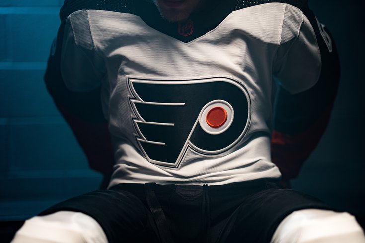
The Flyers revealed their 1970s-era Reverse Retro uniform from Adidas on Thursday.
The NHL's new wave of Reverse Retro jerseys were revealed Thursday morning and the Flyers' one won't be straying all that far away from their usual look.
Here it is:
Vintage Flyers History Remixed.
— Philadelphia Flyers (@NHLFlyers) October 20, 2022
Introducing our @adidas Reverse Retro 2022 #reverseretro Available 11.15.#FueledByPhilly x @adidashockey: https://t.co/b4qWJ6Hv8P pic.twitter.com/BEX3yQy4C3
Not all that different from their road kit, with the biggest change being a color reversal (yeah, I know) of the orange and black over the shoulders and sleeves.
A design breakdown from the Flyers:
"This season’s Flyers Reverse Retro jersey honors the 1974 and 1975 Stanley Cup Championship teams. The iconic Flyers crest will showcase dimensional embroidery treatment raising the outline around the front crest featuring a thin black outline surrounding the crest to match the original worn only in 1974. The jersey is remixed in an almost all white and black color palette, while slight accents of burnt orange pay homage to teams from the 1990’s. The current NHL Shield logo is also remixed in vintage orange and black colors."Another note: Travis Sanheim, who signed a massive extension right before the start of the season, is shown skating around in the infamous Cooperalls at the end of the reveal video.
Those are making a return as well, but for warmups only, per the team.
"Also returning for the first time since the Flyers’ 1981-82 and 1982-83 seasons are Cooperalls, the infamous full-length black nylon pants with an orange stripe down each leg. The 80’s era pants will be worn by players during warmups only when the team wears the Reverse Retro jerseys."
Orange & Black & Cooperalls.
— Philadelphia Flyers (@NHLFlyers) October 20, 2022
The early 80’s long hockey pants will be worn during warmups each time we wear our new #ReverseRetro @adidashockey jersey. A brief history of the look that lasted only two seasons: https://t.co/rsV9qzlsfF pic.twitter.com/9B2l401SR4
The Flyers will wear their Reverse Retros eight times beginning November 8 against St. Louis and including the Black Friday game against the rival Pittsburgh Penguins, who are bringing back the mid-90s era crest for their alternate.
Here's the full schedule:
• Tuesday, November 8 vs. St. Louis Blues
• Wednesday, November 23 at Washington Capitals
• Friday, November 25 vs. Pittsburgh Penguins | NHL Thanksgiving Showdown
• Thursday, December 1 vs. Tampa Bay Lightning | 80s Throwback Thursday
• Thursday, December 15 at New Jersey Devils
• Thursday, January 5 vs. Arizona Coyotes | 90s Throwback Thursday
• Saturday, January 14 at Washington Capitals
• Thursday, January 19 vs. Chicago Blackhawks | 2000s Throwback Thursday
⚪️🟠⚫️#ReverseRetro
— Philadelphia Flyers (@NHLFlyers) October 20, 2022
Get yours 11.15.#FueledByPhilly x @adidashockey pic.twitter.com/yeJXE1VeAW
Adidas, the NHL's uniform manufacturer, rolled out the Reverse Retro initiative two years ago, and though it launched in a weird spot – the COVID-19 pandemic was still going strong and the league and NHLPA were unsure of when and how they would play the 2021 season – the jerseys were, mostly, a huge hit among fans.
Some long-demanded classic designs made their return – the New York Rangers, for example, brought back the "Lady Liberty" logo and the Colorado Avalanche paid tribute to the franchise's former life as the Quebec Nordiques – while some of the more experimental designs from the 1990s and early 2000s were given a second lease on life, like the Anaheim Ducks' so bad it's good Wild Wing jersey and the Vancouver Canucks' gradient sweater.
Then you had teams like the Detroit Red Wings and New York Islanders who didn't even try.
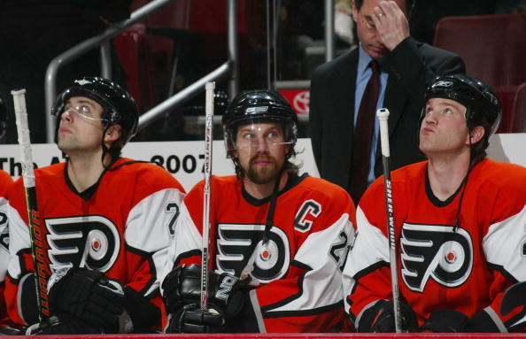
The Flyers got a slight color inversion of their 90s "Legion of Doom" era jerseys – 1995 to be exact – which took the base orange template and again, inverted the white and black across the sleeves and shoulders.
Reverse Retro 2.0, which has been subject to leaks and rumors going back months, is more of the same in that regard. Some teams have huge hits, others huge misses, and the rest somewhere in the middle, all ultimately subjective.
The Flyers are probably in the middle here, though I'm very much digging the Washington Capitals' black version of the "Screaming Eagle."
#ReverseRetro is back!
— NHL Public Relations (@PR_NHL) October 20, 2022
In collaboration with teams, @adidashockey and the @NHL unveiled jerseys that call back to unique historic moments in each Club’s history and will be worn during the 2022-23 season beginning in November. https://t.co/hCCrvqEOJh pic.twitter.com/XY0uzv3lxF
Personally, I was hoping the Flyers would maybe bring back a version of the chrome jerseys from the early-mid 2000s or do something riskier in the idea of revisiting a past that never was.
In the mid '90s, the team was looking into adopting a third jersey and was in talks with California design firm The Mednick Group to create it. Staffer Ken Loh was on the project and proposed introducing teal into the color scheme along with a secondary logo that was a radical departure from anything the Flyers have used before or since.
The pitch fell through and the public never saw it until years later, when Loh talked about the process and showed the designs to jersey watchdog Icethetics in 2014, which you can read about HERE or watch below.
Alas, that pitch will remain in the timeline that didn't happen.
Follow Nick on Twitter: @itssnick
Like us on Facebook: PhillyVoice Sports


