


April 05, 2019
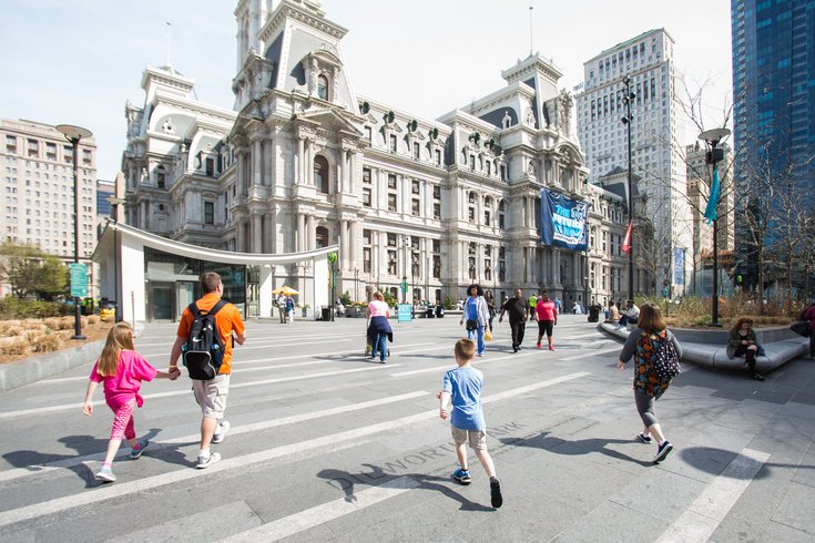
Philadelphia, as you know if you live here, is home to a great number of people, and a lot of those people are very different. Almost everyone living here would consider that a good thing.
Yet the great Northeast corridor of New York City and Washington, D.C., is often derided as being out of touch with “real America”, as if the people living in those cities are somehow living in a fake America. It happened again this week, this time in the Wall Street Journal.
But it turns out, the population of Philadelphia and its surrounding areas, sandwiched between the two big northeastern centers of East Coast power, is actually extremely representative of “real America”.
Data website FiveThirtyEight decided to put together an investigation into which metropolitan areas across the country accurately represent the United States’ current demographic makeup. The site selected three demographic measures: age, educational attainment, and race and ethnicity. A perfect score of 100 would mean a metro area aligns perfectly with the country’s demographics.
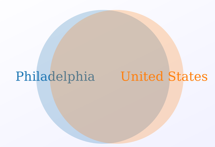
The Philadelphia metropolitan area — which includes Philly, Camden, Wilmington, and one nearby county in Maryland — ranked ninth in the country among metro areas with at least 500,000 residents. Its similarity score is 87.2, meaning the demographic makeup of the Philly metro are overlaps 87.2% with the United States, as a whole.
If you put Philly’s demographics and the United States’ demographics into a Venn diagram, this is how it would look:
That’s a pretty solid amount of overlap. Thanks for the visual, Meta-Chart.com.
The top similarity score is the New Haven-Milford metro area in Connecticut, which scored a 93.2% overlap. The Tampa-St. Petersburg-Clearwater metro area in Florida finished second at 91.6%, and the Hartford-West Hartford-East Hartford (so much Hartford!) metro area finished third with 90.2% overlap.
FiveThirtyEight also investigated which current-day metropolitan areas with at least 500,000 residents are most similar to the demographic makeup of 1950s America, a makeup the site says people often equate with the “real America”.
The second-closest metro area in the country to the America of old is also in Pennsylvania: The Lancaster metropolitan area has a 55.2% overlap with the 1950s demographics, behind only the Ogden-Clearfield metro area in Utah.
Ultimately, it seems the old "Pennsyltucky" adage about Pennsylvania holds up. The middle of the state and the edges of the state are different places; so much so, in fact, that they represent entirely different eras in the United States' history.
Follow Adam & PhillyVoice on Twitter: @adamwhermann | @thePhillyVoice
Like us on Facebook: PhillyVoice
Add Adam's RSS feed to your feed reader
Have a news tip? Let us know.