


February 19, 2015
 Thom Carroll/for PhillyVoice
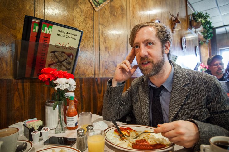
Anthony Smyrski, creator of Megawords magazine, at M & M Restaurant, 2736 E. Allegheny Ave.
An old Ukranian man walks into a diner. He’s flanked on either side by two cops from the 28th district. He doesn’t speak English, and a woman at the booth behind us steps in to translate. The words “immigration office” come up.
Why is he here? Where did he come from? It seems like he summoned them, rather than the other way around. He sits in the back of the police van, headed to who knows where.
On this day, Anthony Smyrski, creator of the free, urban-inspired magazine Megawords and Random Embassy design group, invited us to the M & M Restaurant in Port Richmond, a working-class neighborhood of Philadelphia. He lives down the street, on Belgrade, in the house where he grew up.
“[Port Richmond]’s a very working-class, inner-city neighborhood. It’s a little rough around the edges. It’s not like the worst place ever, but, you know, it’s a neighborhood,” Smyrski said.
Now an unofficial ambassador of the post-industrial enclave, he left for Los Angeles and New York after art school, only to return when his father asked him to buy the house outright. On his way back, the city looked a little different.
It wasn’t the first time that happened.
Every day of high school he’d walk to the corner of Kensington and Allegheny and wait for the bus. Then, like now, it was a notorious street corner for drugs and violence. He took pictures. He made those pictures into zines. And, in the process of documenting his hometown, he realized he could transform it – or, at least, how it could look to somebody else.
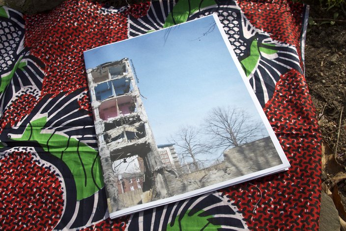
Megawords publishes images from cities across the world. The greatest compliment, Smyrski says, is when someone mistakes their neighborhood for one in a photograph. It goes to show: The intimacy of natural decay always feels familiar. We see ourselves — our neighborhoods — in the ordinary moments of a city abroad.
While buildings like the working yarn mill or Cramers Uniforms on Frankford Avenue show layers of repurposing over 20 or 100 years, that doesn’t hold a candle to the thousands of years of change seen on European structures. If Smyrski’s any proof,sometimes you have to leave the fold to see it anew.
“The neighborhood itself – it’s not that it’s necessarily the source of inspiration. It is in the background. It’s the thing that put me in the position to be able to appreciate all these other things that I experience, that I go out and look for, that I don’t think I knew why I was looking for for a long time until I came back here.”
A Polish-American and onetime altar boy who didn’t speak Polish fluently, Smyrski was used to being a hybrid outsider-insider. It’s that perspective, inside looking out — and back in again — that awakened him to the beauty in imperfection embodied by his neighborhood.
“That made me have an appreciation for different cultures and different ways of doing things – and appreciation for how people live their lives differently,” Smyrski said.
Signs on Kensington Avenue. Thom Carroll / For PhillyVoice 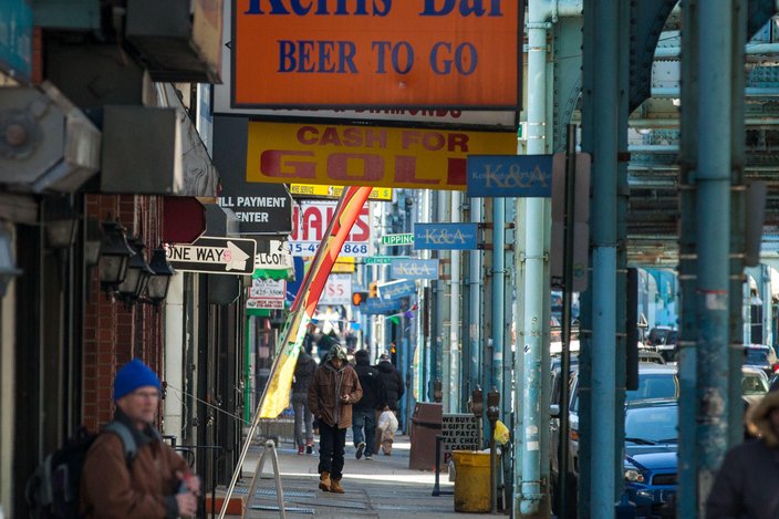
K&A remains as insane as it always was. The M & M Restaurant, with its $5 eggs, potato and toast special, hasn’t changed a bit. But what changes is the lens of the observer, who grows to appreciate what a structure was, could potentially be and “inherently is.” Known in Japanese as wabi-sabi, it's a design principle he learned in art school that evokes the idea: “Nothing is finished.”
Revisiting the stuff of childhood through a grownup perspective can return you to your inner kid.
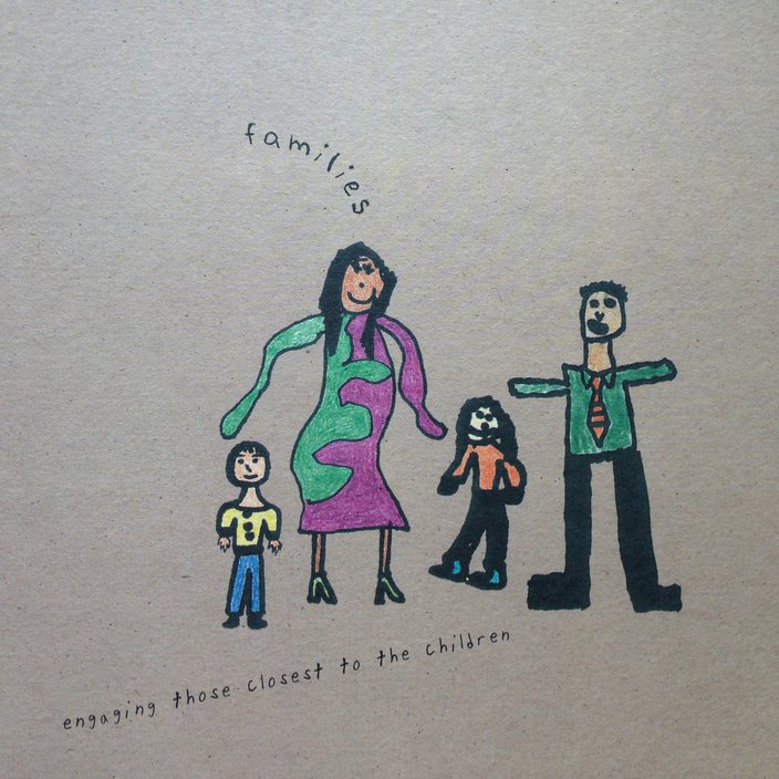
Soonduk Krebs, owner of SK Designworks in Midtown Village, calls design that does this “naive art” — art made by an untrained mind that knows no formal limits. It’s the basis of her relationship with younger designers: They see what she, a professor at the Tyler School of Art, might miss. By her own admission, she knows too much.
It takes the appearance of a crudely made antique, vintage flour sack or mismatched outfit to jog her sense of lawless wonder. Street style offers one such glimpse. Krebs notices when someone’s look has one piece out of sync with the rest, a “bad but endearing” look.
“It’s how they put it together – not quite trained. Like a grandmother walking down the street, and everything is very grandmotherly, and then there’s one thing – and sometimes I think, maybe her daughter bought it for her. It’s a little bit of a mismatch. Or some guys who walk down the street and I can tell it’s the girlfriend who bought that jacket.”
When it came time to curate art for the Philadelphia School District's Children Achieving Challenge annual report, Krebs’ studio opted to source illustrations from elementary-school students. What the middle-school and high-school kids made lacked the primitive edge of their younger counterparts; they were of the age to mimic, rather than create.
“Don’t you love when they have to write something, they don’t have enough space, and they go around the top and wrap around it? Adults don’t often do that because we think it’s not professional; it’s not right.”
Inspiration lies not only in a re-imagined past, but also in a magnified glimpse of the present.
Jason Ganski and Thomas Foley, former restaurant industry pros turned designers with a restaurant niche at Sedso Design in the Piazza, have been known to take drives to rummage for items in the trash. Foley says they find gems in the “alcoves of stuff” under the Reading Viaduct.
Rather than always digging deep in their backyard, the designers look inside a business to chase an appropriate design: The leather of a banquette, the plaster in a ceiling or old signage could turn into a menu or a new handmade typeface.
“You don’t know where it came from. It had this previous life that you know nothing about. And sometimes it’s nice to just not throw it in the garbage,” Foley said.
A picture frame found on the street ended up on the wall of Loco Pez; they put in a picture of Enrique Iglesias' father Julio, a cultural icon little-known to most Americans. Notably, that picture frame was, at one point, stolen off the wall. It’s the age-old story of one man’s trash being a designer’s treasure: By imbuing a castaway item with a brand, they gave it value and new life in the possession of another passerby.
When done right, a fully realized concept follows a visitor from entry to exit: a wraparound reality that constantly references its main motif. Case in point: The branding of Jose Garces’ tasting-menu restaurant, Volver, plays on the name, which means “to return” in Spanish.
True to concept, a symbol of overlapping circles captured the chef-owner’s return to the kitchen, as well as his interest in molecular cooking. The rotating light projection on the building’s exterior imparts a final message of change, ongoing, multi-faceted, always coming back on itself. It’s the final sendoff in a well-rounded dining experience — a personal vision that follows you out onto the street.
People, like symbols, street corners and scarves, all have stories to tell. It’s a designer’s job to spot them and weave them into an urban narrative. A city’s soul lies between the lines, just waiting to be heard. As one story ends, another begins, coming full circle in a world forever unfinished.